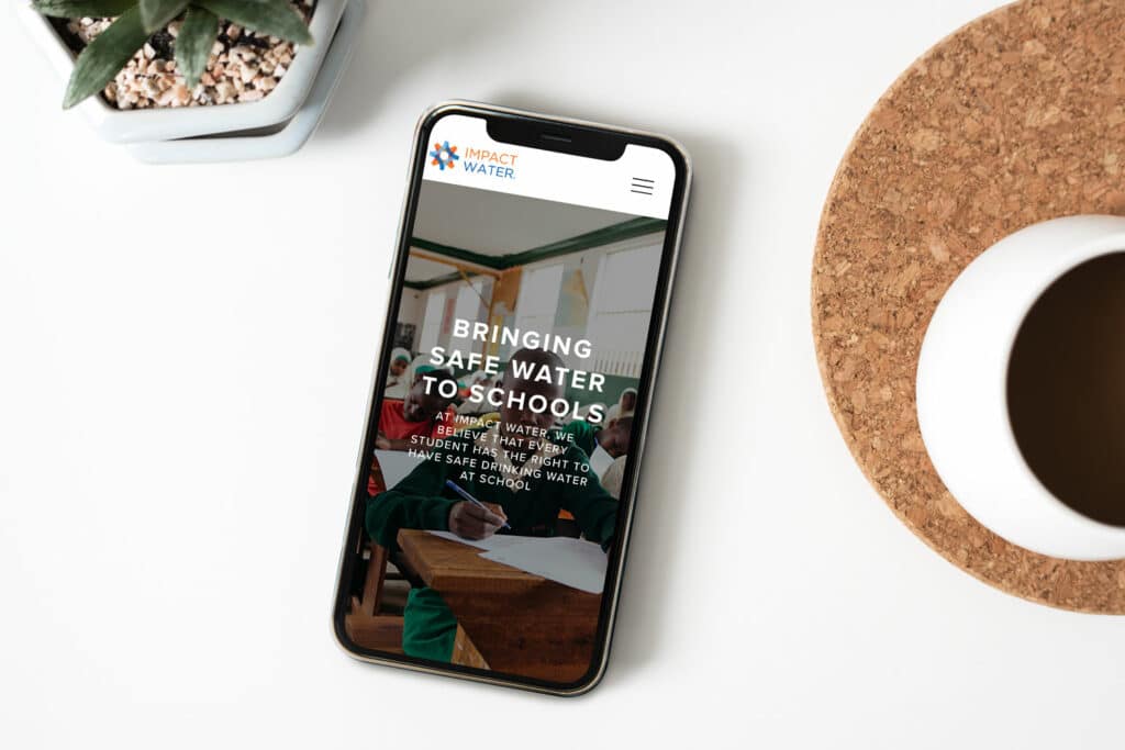
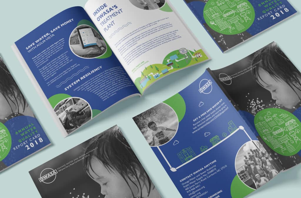
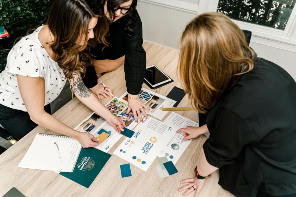
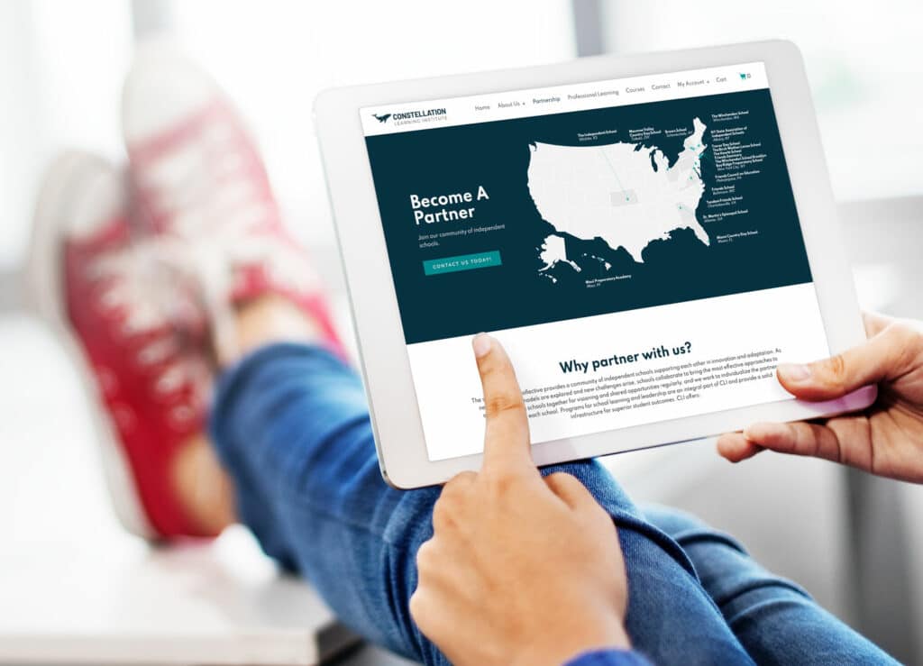
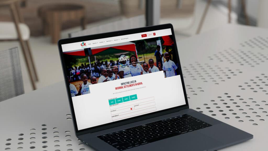
Carrboro Creative prides itself on our work with local and global nonprofits for their branding and website design. Our values of community and compassion align with the missions of the nonprofits we work with. Like all our clients, the nonprofits we work with need a professional and well-designed website to create brand awareness and grow their mission. As a nonprofit, your success depends on how well you reach and persuade potential supporters. A strong website conveys your organization is healthy, professional, and trustworthy. A strong digital presence will increase visitors’ confidence and willingness to contribute to your mission. A website that is easy to navigate will help your visitors learn more about your organization and get them onboard. While every organization has different needs and a unique audience, there are some best practices that every nonprofit should embrace in their website design. When you work with Carrboro Creative for your website and branding, we incorporate these elements to best serve your organization and your audience. A strong brand identity facilitates trust and recognition with your audience. Using photos and videos will help build a strong visual identity for your organization. Imagery is an emotional medium. Sharing powerful images and videos to tell your organization's story will help create a small emotional connection between your mission and its supporters. All aspects of your visual branding play a role in how potential supporters view your organization. Use color, graphics, and design to create emotion and set the tone of your mission. When working with Carrboro Creative, our team designs logos and color pallets that support the story and mission of your organization. Our team uses strategy, design, and psychology to create a strong and compelling visual identity for your nonprofit. Take our work with OWASA as an example. They reached out to us as they felt their previous brand image did not effectively communicate their purpose and values, leading to stagnation within the industry. We refreshed OWASA's brand colors and typography to convey warmth, energy, and easy readability. Our design included custom illustrations, icons, and infographics representing the natural water treatment process. The balanced color scheme exuded calmness and purity, echoing OWASA’s environmental commitment. Although maintaining their existing logo, the overall brand aesthetic now resonates with the audience at first glance. OWASA annual report with updated branding You have a powerful story behind your mission. Your website needs to walk visitors through that story and connect with them with shared values. Your story should tell visitors who you are, what you do, and why your mission matters. It is how you communicate your mission and how you are making an impact. Your story doesn’t have to be told in just text. Use photos and videos to engage and connect with your supporters. Tell your story in a way that validates the reader's values and invites them to join the mission. Your website design should be centered on the journey you wish your supporters to take. Don’t make your visitors work to discover what you are all about and why you are worthy of their time and donations. Put that message front and center and tell your story in a way that quickly educates and engages your audience. One of our favorite examples of using strong visuals to help with the storytelling aspect is Refugee Support Center. Refugee Support Center (RSC) is an Orange County non-profit organization committed to helping refugees rebuild their lives and establish a secure footing in their new communities. We revamped RSC's logo to incorporate an inviting illustration that symbolizes a haven for refugees seeking help and support. To further drive home the organization's core ethos, we devised a powerful and inclusive tagline: "All refugees are welcome." The website's transformation featured a warm and approachable design, starting with a homepage adorned with a captivating hero image depicting refugees from various cultures. By showcasing RSC's remarkable achievements and statistics, we were able to convey the organization's competence and empathy. Carrboro Creative team working on RSC's brand identity In addition to your organization’s story, share how your nonprofit impacts your communities. People want to see tangible progress your mission is making. Impact statements often use statistics and quantitative measurements to give visitors a frame of reference on how your nonprofit fulfills its mission. One of our favorite ways to achieve this is through visuals. Take our work with Constellation Learning for example. They wanted to illustrate their wide range of partners, so we designed a map that clearly highlights their partnerships. It should be crystal clear how visitors can support and participate in your mission. Once they are invested in your story, invite them to take action. Create clear calls to action with buttons, forms, and simple navigation. Use contrasting colors to make your CTA stand out. The next step is to position them on the page in places that make sense and feel natural. Prominently feature links to your donation forms, newsletter opt-in, and social media profiles. Your website should also be simple to navigate. Navigation should be intuitive and purposeful. Knowing the path you need visitors to take will streamline your navigation and always lead them to a call to action. Be careful not to clutter your user experience with too many CTAs. Giving your visitors something different to do at every turn can feel overwhelming and confusing. Focus on the actions that matter the most and prioritize how they are presented. A donate button in your main navigation menu is easy to find when supporters are ready to contribute. If you have a fundraising event coming up, you might change some of the newsletter opt-in buttons to CTAs to purchase event tickets. Clear and simple are key! GSSG clear call to action Donors will drop off if your donation checkout process is long or complicated. Choosing the right donation platform tool is important for increasing conversions and collecting donations. There are several nonprofit donation software platforms on the market. Choose one that meets your organization’s specific needs and creates the best user experience for your supporters. Carrboro Creative will seamlessly integrate your donation forms, buttons, and landing pages into your website. Did you know that 51% of nonprofit website visitors use their mobile devices? Mobile-friendly websites also convert 34% of visitors to donate. If it is hard to read the content or find the right button, mobile visitors tend to abandon their visit without taking action. Most web platforms have mobile optimization as a feature. If not, make sure you are taking the extra steps to enhance the website experience for your mobile visitors. Some things to consider are: All websites designed by Carrboro Creative include a mobile-optimized site. We make sure that no matter how your supporters visit your website, it is a world-class experience! Why good design is essential for a nonprofit website
Elements every nonprofit website needs
1. A strong brand identity
2. A compelling value-centered story
3. Show your mission’s impact and share success stories
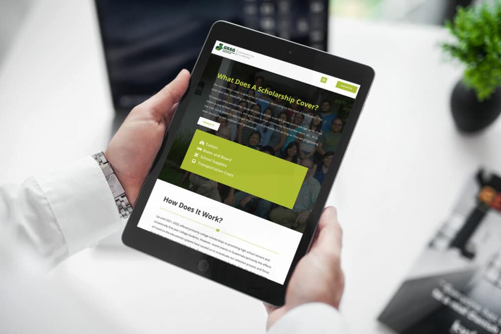
4. A clear call to action + simple navigation
5. Easy donation process
6. Optimized mobile experience